
Technology
Ensuring Quality and Security with ISO 9001 and ISO 27001 Certifications
ISO certifications play a vital role in ensuring organisations’ quality and security standards across various...

User experience (UX) design is a crucial aspect of creating digital products that are both functional and enjoyable to use. However, with the ever-evolving digital landscape, it’s easy to fall into the trap of bad UX design practices that can lead to frustration and dissatisfaction among users.
In this article, we’ll take a closer look at some of the most common bad UX design examples in 2023 and offer practical tips for avoiding these pitfalls.
Whether you’re a business owner, designer, developer, or just someone interested in creating better user experiences, this post will provide valuable insights and inspiration for creating digital products that users love.
At a high level, good UX design is focused on creating a seamless, intuitive, and enjoyable experience for users. A good UX design prioritises the needs and goals of the user, making it easy for them to accomplish tasks and achieve their objectives using the product. The interface should be aesthetically pleasing, visually appealing, and easy to navigate. The user should feel confident and in control when using the product, and the design should eliminate confusion, frustration, and friction.
Bad UX design, on the other hand, is characterised by a disregard for the user’s needs and goals. The design may be cluttered, confusing, and challenging to navigate, causing frustration and even anger. As a result, the user may feel lost or overwhelmed, and the design may not effectively support their tasks and goals. The design may also be aesthetically unappealing and visually distracting, detracting from the overall user experience.
A few key factors that can help us delve further into this and explore the differences between good and bad UX design are as follows.
Good UX design focuses on understanding and catering to the user’s needs and preferences. In contrast, bad UX design prioritises the goals and objectives of the company or designer without considering the user.
Good UX design makes products easy to use and intuitive and provides a seamless experience for the user, while bad UX design creates confusing, cluttered, and difficult-to-navigate products.
Good UX design incorporates visually appealing design elements that complement the user experience. In contrast, bad UX is designed to pay more attention to neglect aesthetics or use them in a way that detracts from the product’s intended experience.
Good UX design takes into account the needs of all users, including those with disabilities, while bad UX design may not consider accessibility altogether or may implement it ineffectively or sporadically.
Good UX design maintains consistency in branding, layout, navigation, and other design elements across different pages and devices, while bad UX design may have inconsistent or conflicting design elements.
In essence, by prioritising users’ needs and creating a user-centred, usable, aesthetically pleasing, accessible, and consistent product, designers can ensure that they are producing good UX design.
Ultimately, Good UX design is crucial for creating a positive user experience, building brand loyalty, and increasing customer satisfaction. On the other hand, bad UX design can lead to a negative user experience, which can harm a brand’s reputation and drive away customers.
The Link In Bio feature could do with some optimisation from a UX perspective. The link in the bio feature on Instagram could be more optimal because it is limited to not more than one clickable link, which can be frustrating for users looking to access multiple pieces of content or information. Additionally, the process of copying and pasting the link is time-consuming and not user-friendly.

The “Delete Message” feature doesn’t really do what it says. Informing the recipient that a message sent has recently been deleted somewhat defeats the purpose of the feature and inevitably leads to awkward follow-up questions such as “what was that?”, “did you send something?” or “why did you delete that?”.

Just delete the message instead of blocking it on the recipient’s end, and provide clarity regarding the messaging. The critical point here is that there should indicate what will happen when the feature is used.
An alternative idea would be to allow for the choice of a grace period of around 5-10 seconds for the sender (just as with Gmail) – so that they can delete/discard the message without it ever reaching the recipient.
Whitespace overload. Too much of a good thing can be harmful. Unfortunately, that’s exactly what Yahoo’s website struggles with. Whitespace is an essential element of excellent UI design, but relying too much on it can lead to bland and uninspiring designs.
The website could also improve on balancing out the use of whitespace throughout the page. For instance, above the fold, there is too much of it, but as you scroll down, too much content and very little spacing lead to information overload and clustered layout issues. Furthermore, the abundance of ads on the page and relatively small font amplify this effect and affect content readability. Because of these issues, you may find users exiting the page without paying much attention to the large amount of information that the website is offering.

Using whitespace in a more balanced approach should help minimise the site’s many readability issues. In addition, minimising the number of ads on the page should also improve the overall browsing experience, improving scrolling speed and reducing information clutter.
The navigation experience could be more straightforward, especially for an eCommerce store. Information overload is a big problem that eBay’s website faces from both a UI and UX perspective. There’s too much going on in the product pages and the toggled section underneath after scrolling.
For instance, just above the fold on the product page, you’ll find information relating to the product’s name, price, condition, attributes like colour, quantity sold, payment gateway, and return and shipping information. Of course, all this information is excellent for the customer, but the problem is that it needs to be presented in a less congested format.
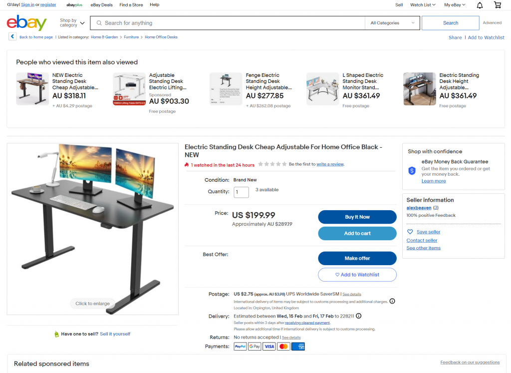
A secondary problem is the presence of multiple CTAs, which can be confusing and overwhelming for the customer. Essentially, the website is asking you to purchase the item right away, add the product to your cart, or save it to your wishlist. But that’s just the tip of the iceberg. You’ll also find other smaller CTAs encouraging you to sell an item, learn special discount tips, save the seller for the future, visit the seller’s store, view similar or related products and so on.
Reducing the clutter and focusing primarily on 2-3 prime CTAs would streamline the page’s focus, improve eCommerce navigation and provide a better online shopping experience.
Use of low-resolution images. Images are the face of your website, which is why they have to be of the highest quality, especially if you want to portray your business in a similar light.
Lipton’s website, though, doesn’t follow this design philosophy. As a result, most images are fuzzy, low-resolution, and take a while to load. Furthermore, most of them are stock images that don’t reflect the product’s features and unique selling points (USPs).

Scrap the low-resolution images, and replace them with high-quality images that capture visitors’ attention and provoke positive first impressions of the brand. Replacing stock photos with corporate images should also help add an extra layer of authenticity and trust to the website.
Outdated design and layout. IMDb’s website layout is too cluttered, with minimal whitespace, little-to-no colour variations, plenty of ads, relatively small font, and distracting content. In addition, despite redesigning several pages in the past, such as its homepage, there are still some major UX issues within some of its pages.
There must be alternative navigation options aside from plain scrolling on the website. For instance, if you wanted to learn more about Chris Hemsworth’s filmography in more detail, your only option would be to endlessly scroll down the page until you reach the section that interests you.
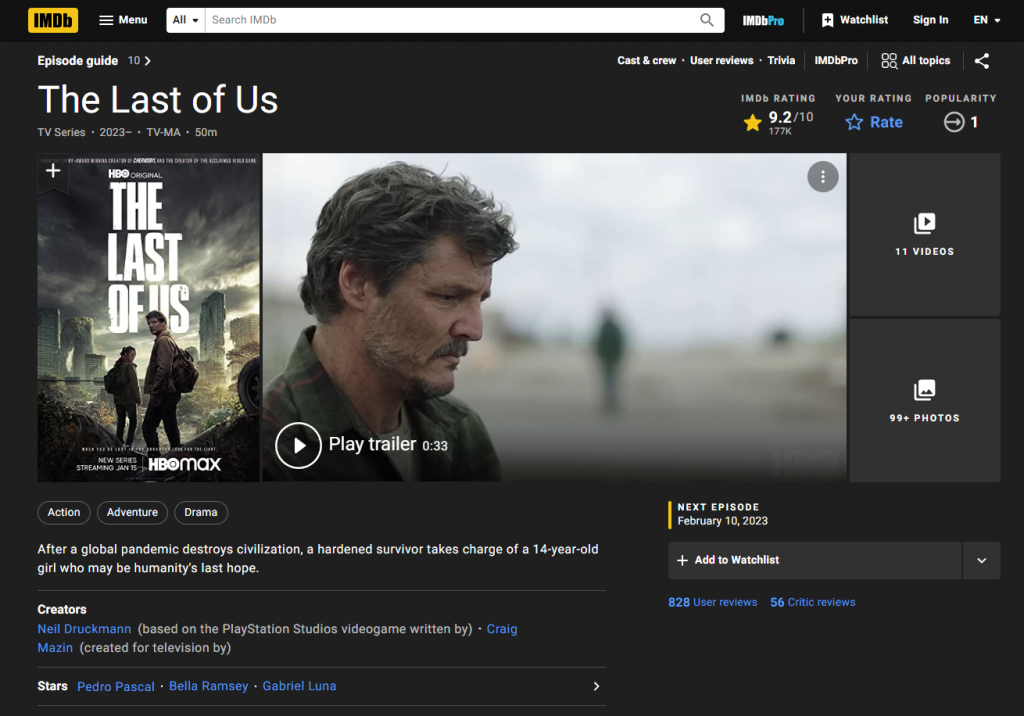
The website can be confusing and overwhelming for first-time visitors, whilst avid readers should now be accustomed to the website’s navigation rules. Thus, reducing the amount of clutter, introducing other navigation options, and adding whitespace appropriately would help improve the website’s layout and, ultimately, the overall browsing experience for new visitors.
Slow page load speed and lousy performance overall. Slow load time is the most significant contributor to bad UX, often leading to high bounce rates and low page interaction. In fact, if you run the website on Google’s PageSpeed Insights test, you’ll find that it fails the core web vitals assessment on both mobile and desktop. Furthermore, as CNN’s website takes quite a while to load, it is most likely causing them to lose traffic from search engines.

CNN’s on-page content inventory is massive, weighing down the website’s performance. Therefore, optimising and/or removing unnecessary/legacy content should help improve the page load speed. Furthermore, reducing unused javascript code, deferring loading scripts until required to decrease network load, and using compression-friendly next-gen image formats such as WebP and AVIF over JPEG or PNG should improve site performance dramatically.
Too many ads. We understand that digital ads are a necessary evil in today’s day and age. They are the reason why so much information online is free to access. But, to align with best UX practices, ads must be displayed in a way that doesn’t disrupt the intended web-browsing experience.
However, this doesn’t seem to apply to Daily Mail’s website, as far too many ads take over the page, becoming too distractive, creating unnecessary clutter and taking attention away from the page’s content.
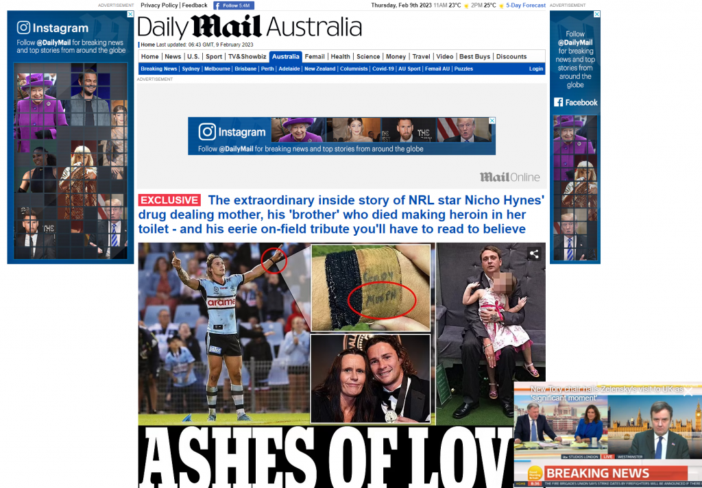
Daily Mail should reconsider its website’s design to reduce the number of ads and change its placement to be less intrusive.
Outdated and non-responsive design. While it’s true that a website doesn’t have to be pretty to be helpful, it certainly has to be functional. And for modern websites, functionality has to extend to all types of devices.
It’s common knowledge that Craigslist’s website is nothing special to look at. Still, surprisingly its most significant problem is not the evident lack of visual appeal but non-responsive web design, meaning all users will not get the same experience. For example, just open the website on your web browser, resize the window, and you’ll find some content will become inaccessible.
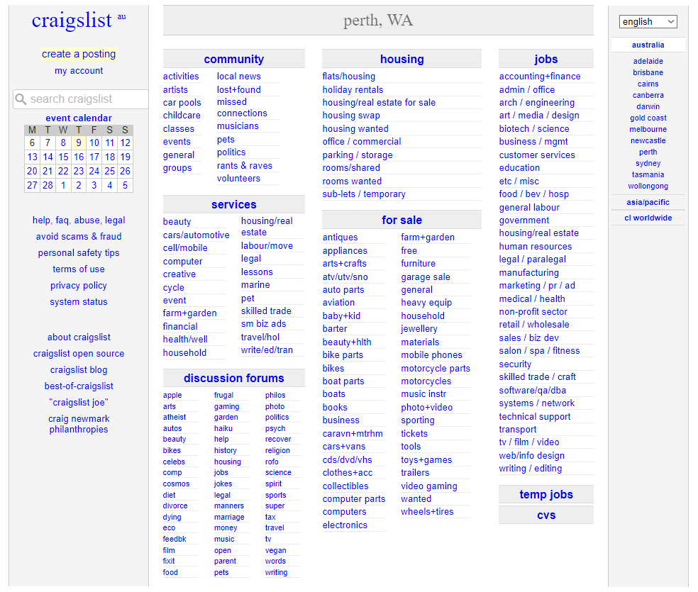
The non-responsiveness of the website is affecting the UX and traffic potential from search engines. Improving the responsiveness by redesigning an optimised mobile version of the site will help lower bounce rates, improve time spent on the page, and lead to a more pleasant experience with the website.
Unconventional navigation and design. Don’t get us wrong, ZARA’s website is phenomenal from a presentation standpoint. The interface is contemporary, unique, and ground-breaking in many aspects of visual web design.
But, the site’s functionality and overall eCommerce navigation system have plenty of room for improvement. Clearly, the brand wants to recreate the magazine reading experience on our computer screen, but it affects the browsing experience.

For one, the text needs to be bigger, and the navigation menu can be challenging to find and navigate as it is too cramped up and hidden behind the hamburger menu, which is dwarfed by the company logo next to it. Lastly, without an apparent CTA, it can often lead customers to become confused or agitated.
Updating the navigation experience by incorporating a more straightforward approach would make the website easier to navigate and ultimately shop. Furthermore, increasing the font size and including icons in the navigation menu would make them stand out more. Increasing the opacity of the slid-up images can also improve the legibility of the title tabs on the bottom right of the page.
Picking nationality from an endless dropdown list can be highly time-consuming and mundane for users, and as a best practice, it’s better to avoid dropdowns with more than 10 options.

Include a filter based to shorten the available options. A text entry option with autocomplete could also be incorporated as an alternate or secondary option.
Bad UX design practices often lead to frustration and dissatisfaction among users. We’ve looked at a few examples of websites that, while not strictly bad, don’t provide up-to-standard UX. Whether it’s a cluttered layout, lack of accessibility or some technical issue such as poor responsiveness and slow loading times, there are plenty of lessons to draw from these cases in order to avoid repeating the same errors when creating our online products.
Thus, we should always strive for customer-focused design solutions with intuitive user experiences that are tailor-made for individual needs. Auditing existing designs with regular sprints is an effective way of discovering any issues early on in development and preventing mistakes before they actually have time to happen. That way, we can achieve fast-loading pages that work across multiple devices without compromising the overall experience.
If you’re looking for an expert team who can help you create excellent user experiences and unleash the full potential of your digital product, then don’t hesitate to book a discovery call today. By doing so, you’ll be one step closer to levelling up your customer experience game.
February 10, 2023