Industry Insights
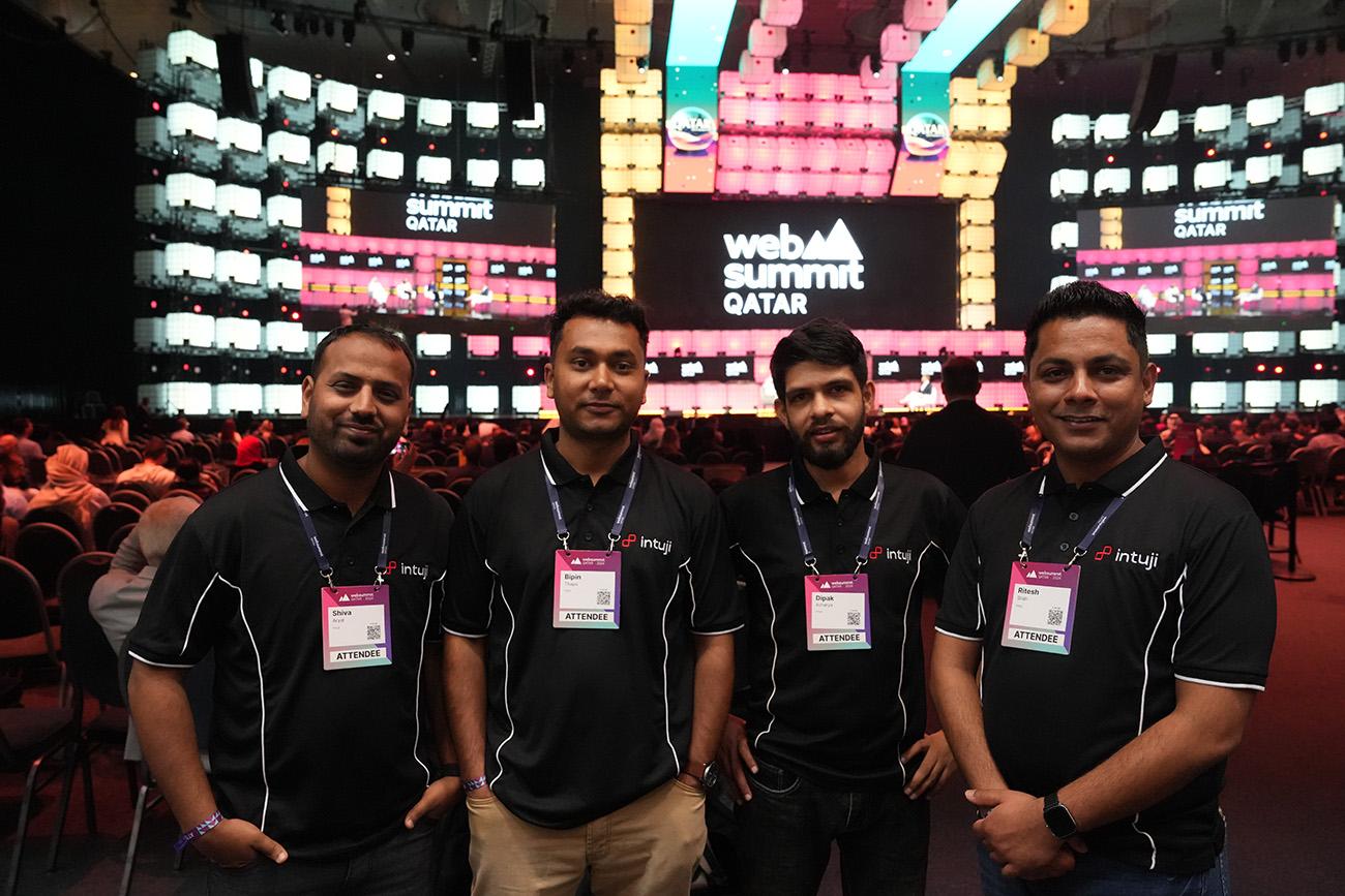
Tech Adventures: Our Team’s Learning Experience at Web Summit Qatar 2024
At Intuji, we understand the importance of staying ahead of the curve in this fast-paced...

Are you looking to create a high converting landing page for your business? If so, there are a few fundamental principles you need to keep in mind.
In this post, we’ll highlight five of the most important ones. By following these tips, you can create a landing page that will help you achieve your marketing goals.
A landing page is a very focused webpage for your business, published on the internet displaying an offer you can make to your target audience with a single conversion goal in mind.
It is a great way to capture your potential customer’s attention and an indispensable part of lead generation marketing. It is the heart and soul of inbound marketing and is critical for generating leads successfully.
However, most landing pages don’t increase conversion rates because they lack the correct foundational strategy and don’t provide enough incentive for today’s consumers to take action.
If you plan on building a landing page for your business (and you should be!), you can follow some straightforward guidelines here to ensure success.
A landing page is created specifically for a marketing or advertising campaign. It’s where visitors land after they click on a link in an email or ads from search engines, social media platforms or similar places on the web. Unlike other web pages that offer numerous options, landing pages are designed with a single focus, known as a call to action (CTA). A landing page should be a campaign-specific page with a single call to action and no website navigation.
As landing pages play a vital role in your marketing campaigns, you want to generate most of the traffic to this page and maximise conversions. Therefore, this article focuses on four primary principles that have effectively delivered positive results over time.
Delivering the right message is not just about writing a compelling headline and a copy, along with a well-placed CTA. It includes a thorough understanding of your target customers’ needs and ends with delivering an honest, compelling message. The right message should be clear and concise, as well as relevant to your target audience.
Your marketing campaign should give out a straightforward and engaging message to inspire your visitors to take action. Therefore, how you deliver the message on your landing page is vital for conversion.
One of the first and most straightforward landing pages is to match your ad’s message. There’s a reason why your audiences click the links of your ads. Keeping your message consistent assures your visitors that they have arrived at the desired destination. It also makes sure you’re not wasting money on people who click your ad and bounce away out of confusion. Unclear and fluff messages can lead to a higher bounce rate.
Apart from consistency in message, the right message on your landing page is the combination of:
If you offer a lead magnet through your landing page to collect visitor information, provide special attention to the lead capture form. It should include information such as what is your offer and how can it help your visitors. As Adespresso shares, “brevity and directness of a well-written CTA will drive the attention on what’s important and remove any distractions”.
A recent survey from Adobe uncovered that two-thirds of people would instead read something beautifully designed than something plain if provided fifteen minutes to consume content. Hence, good design is vital for conversion.
A landing page is a campaign-focused page and can be moulded according to the business’s needs. Therefore, its design should be dictated by its goal, which mostly is conversion. Whether your landing page intends to collect information or make sales, the design and graphics should support the cause.
With your landing page, you’re trying to convert your visitors, not impress them with your design skills. A clean, clutter-free design helps to prevent visitors from getting distracted. It also helps display the CTA correctly. Effective landing pages don’t have confusing navigations and complicated designs. With a clean design, you’ll be making a page that helps people take action. Also, design the landing page experience with a focus on both business goals and the target audience.
It is a universal truth that a picture is worth a thousand words, and messages you write for your audiences are better received in the form of images and graphics. The way you adapt graphics and colours in your landing pages can transform their feel and presentation. And will undoubtedly impact the decision of your visitors.
Right Images and graphics can help increase the time duration your visitor will spend on your page. It will provide you with more time to deliver your message to your leads. Simultaneously, using the right colour can dictate a human mind’s decision process with its psychological effect.
According to research from QuickSprout, 90% of product assessments are driven by the effect of colours. Colours undoubtedly affect conversions hugely!
Visitors would immediately expect to see the information as they land on your page. If they can’t connect with the first sight message, they are likely to leave the page.
The space above the fold is what your visitors see at their first sight of your landing page. Therefore, you must include everything you need there to convince your visitors to take action.
Therefore, a straightforward design with well-put elements such as a headline, a clear CTA button, and captivating graphics can grasp potential customers’ attention. As Forbes states, you have a limited amount of time to convince your visitors, so make sure you start thrilling them from the time they land on your landing page.

In a nutshell, user experience makes your visitors’ experience valuable and as meaningful as possible. It’s a crucial subject because providing your users with a relevant and pleasant experience affects the conversion rate. User experience is a broad topic as it covers all aspects, from visual design to interaction with the visitors. Yet, there are notably a few areas that don’t get much attention.
Before making a final purchase decision, people want to make sure they are making a decision they won’t regret in future. Assure them about your brand or product/service before they bounce away. You can do it in various ways.
There can be more than one reason why your landing page is not performing the way you expect it to. Therefore, you’ll need to frequently test it, which is one way you can develop the best user experience. Most businesses create landing pages and leave them the way they are for an extended period. You don’t have to fix what’s not broken, but if your page is underperforming, you should analyse all the essential areas and keep improving them.
Tools like Hotjar can help you understand how your users experience your page, where they are clicking the most, and what is invisible. Frequent testing and improvement will surely help you improve the outcome, creating a better experience for your visitors as well.
At WEBO Digital, we believe great user experience combined with delivering the right message can make a successful landing page. A frequent test is still crucial to make sure your activities are providing you with the results you are looking for. Contact us for unique digital marketing ideas for your business.
August 30, 2021